[loading]
Finance
Spero
by Goodside
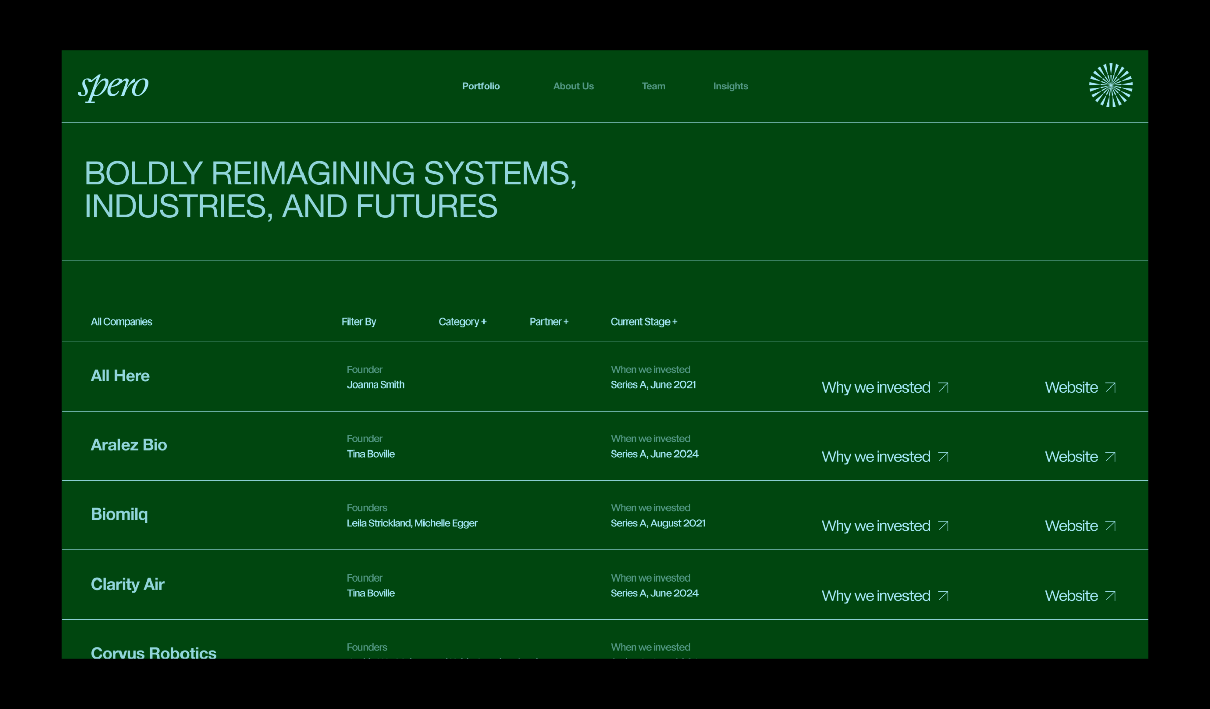
Spero's rebrand effectively uses a serif italic wordmark contrasted with a sharp radial icon, creating a distinctive and un-trendy visual. The combination of forest green and sky blue palette, alongside Helvetica Neue with varied case and scale, offers a sophisticated yet accessible aesthetic. This layered typographic approach, pairing bold messages with granular details, provides excellent versatility for brand communications.