[loading]
Software
Sift
by GOAL
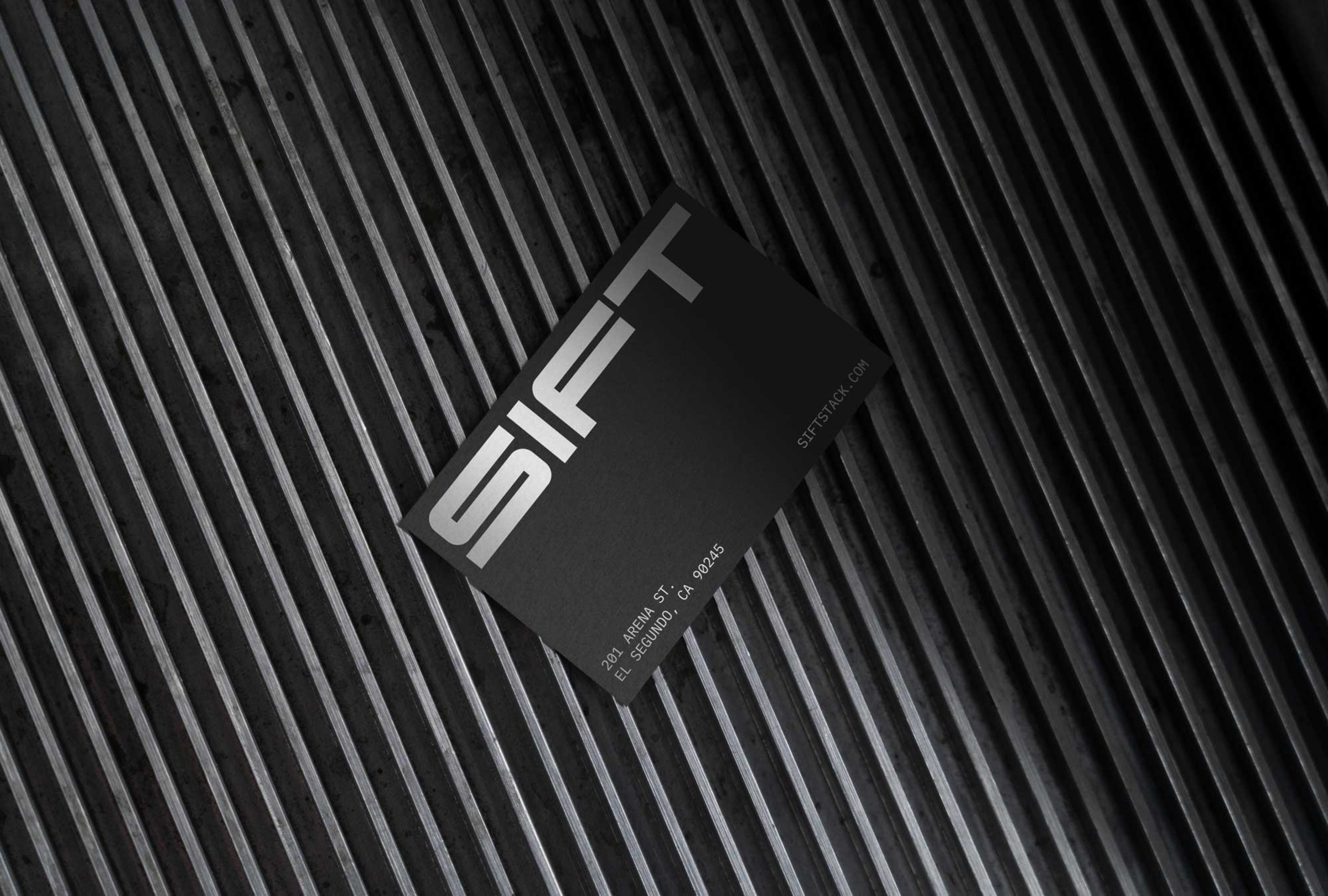
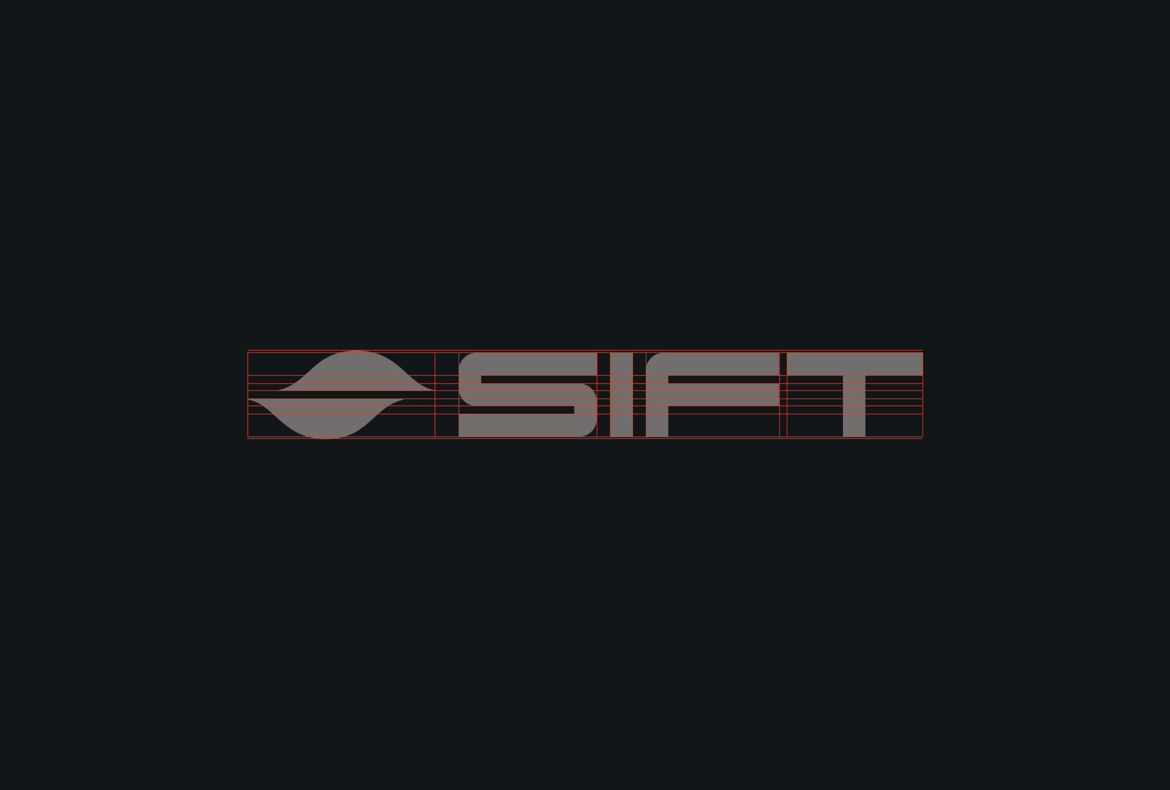
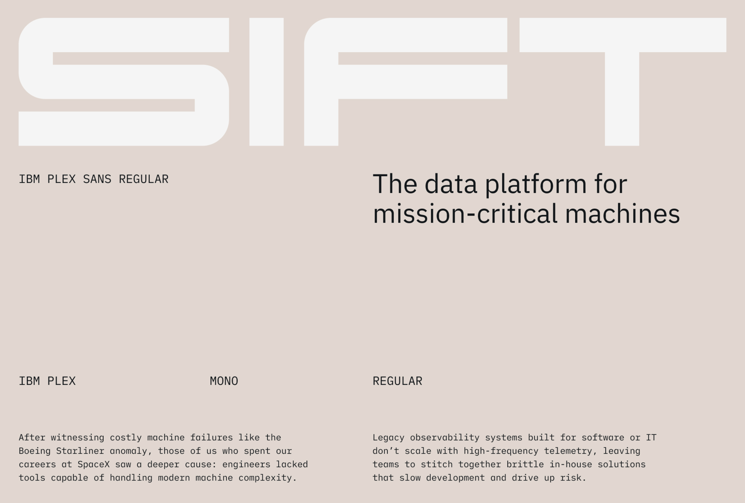
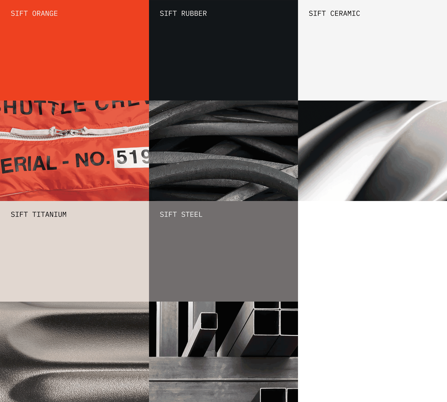
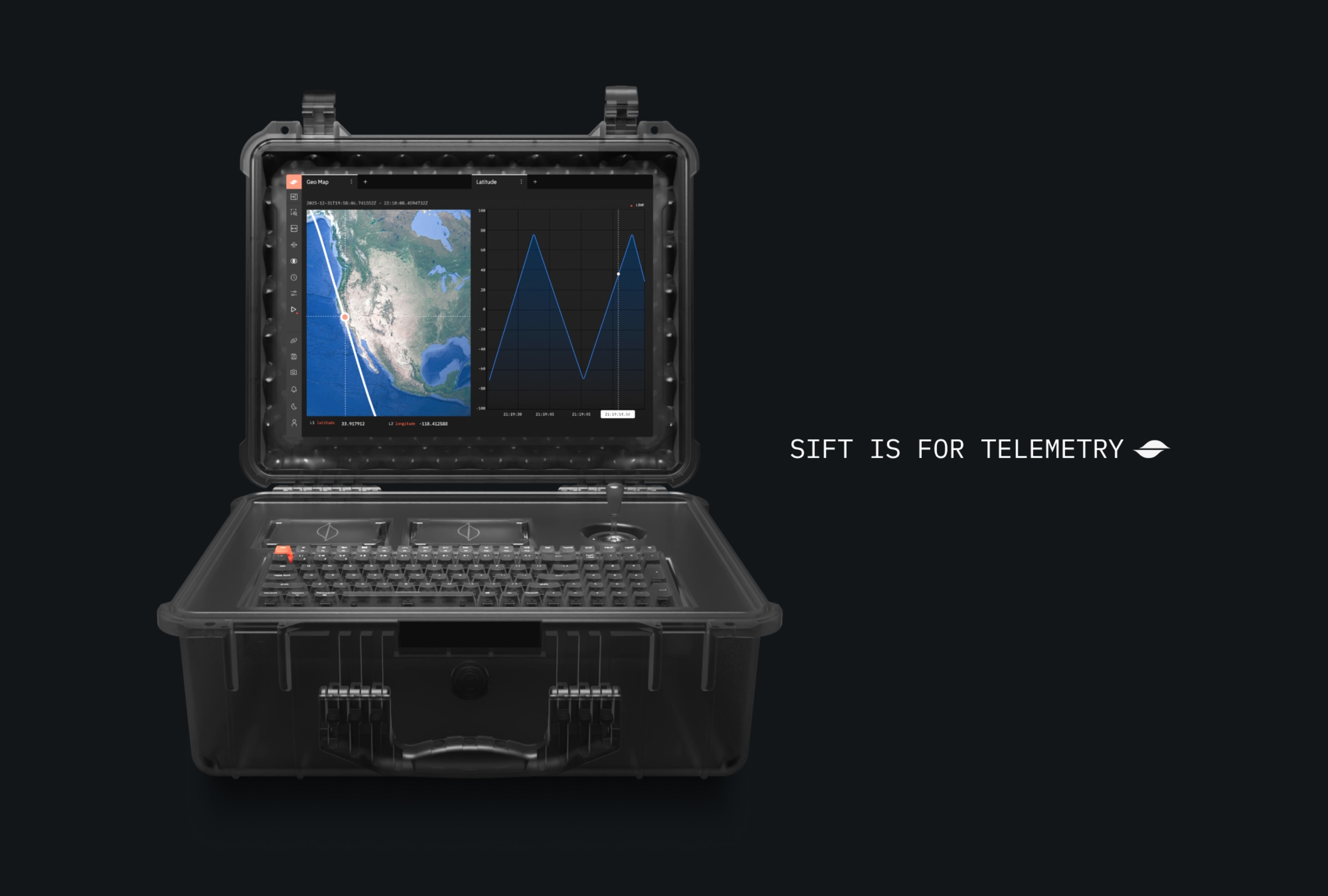
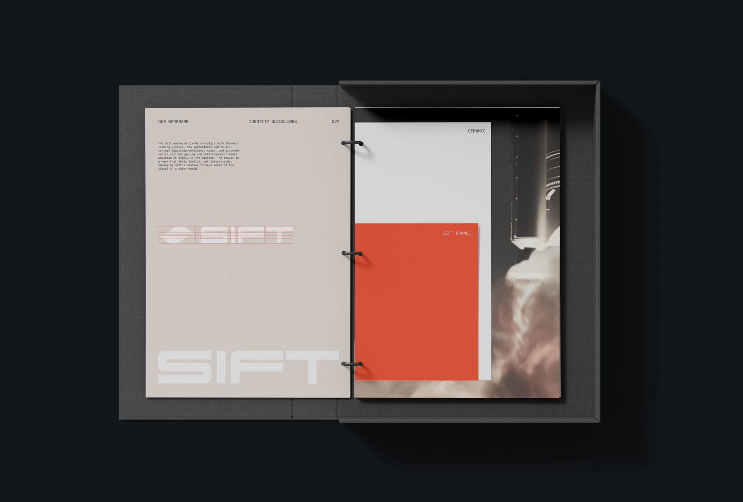
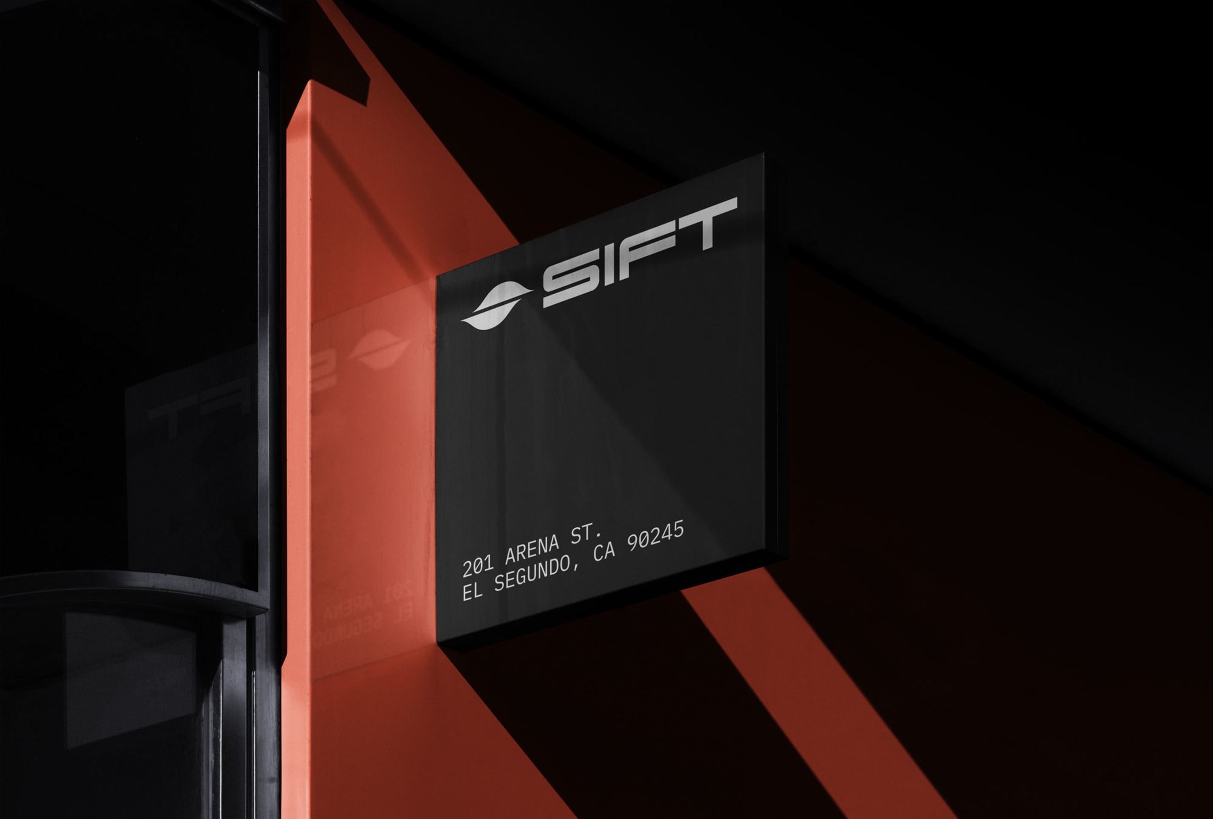
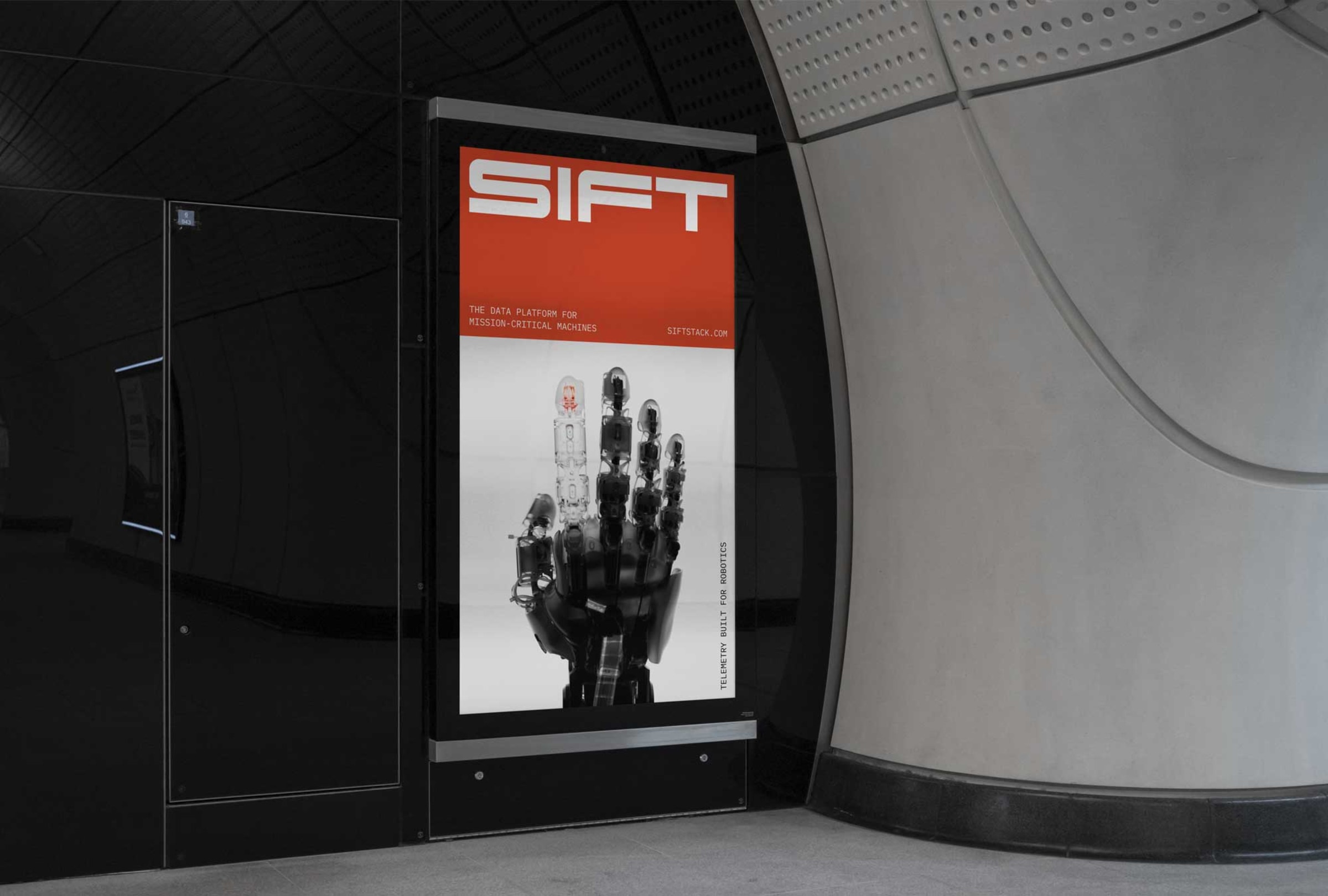
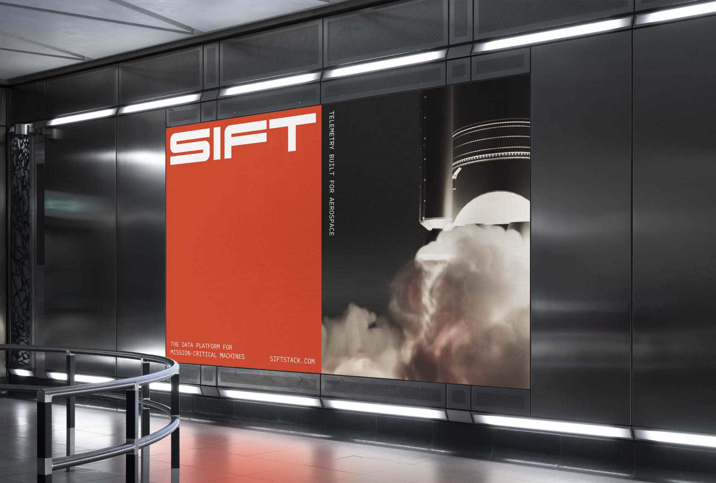
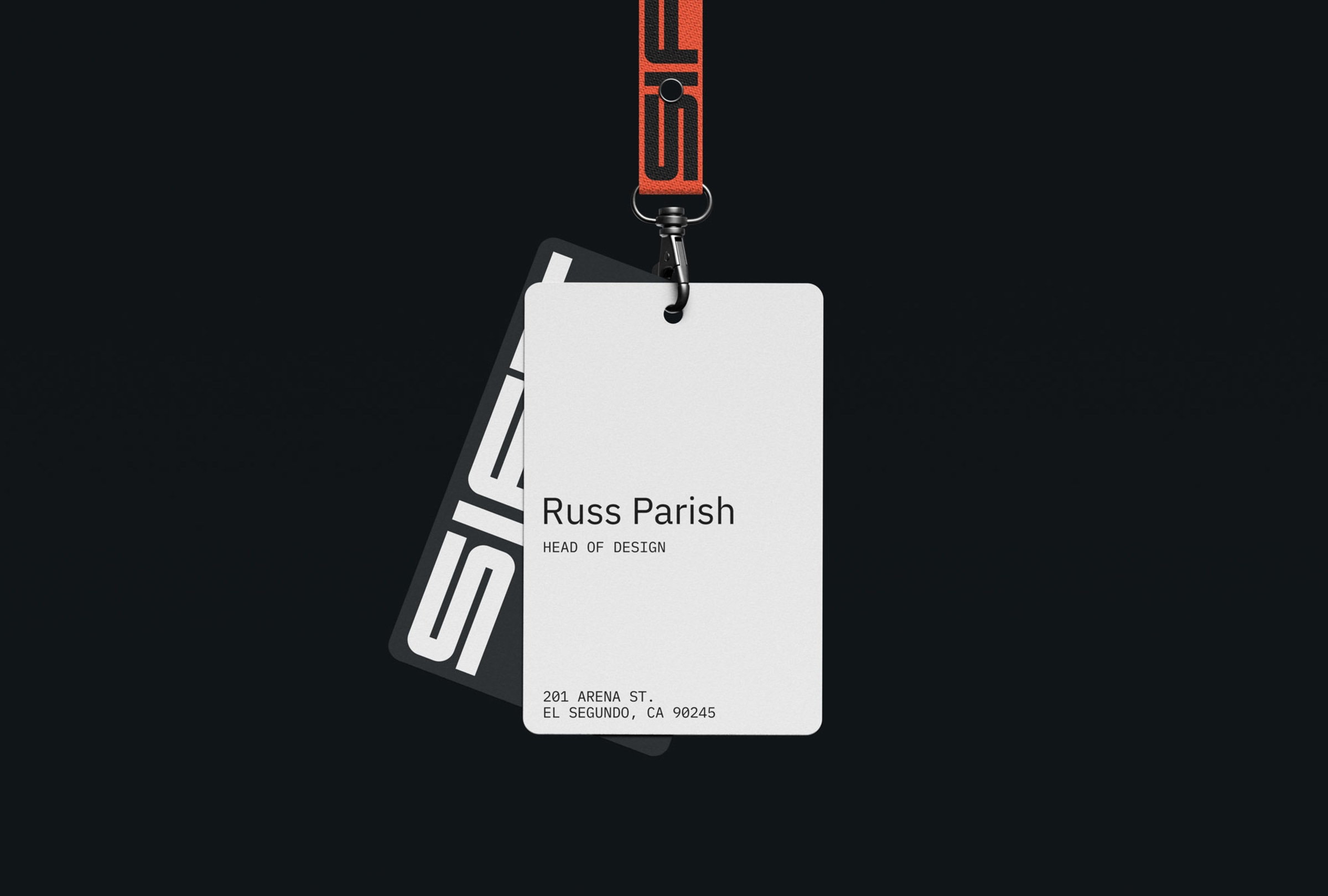
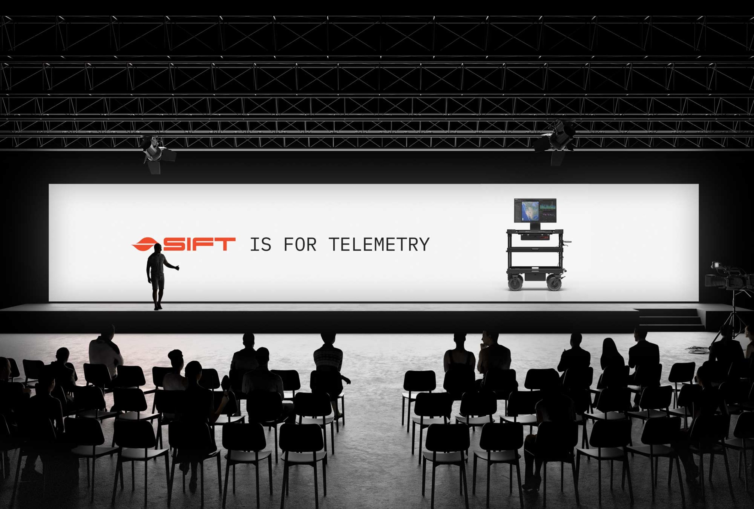
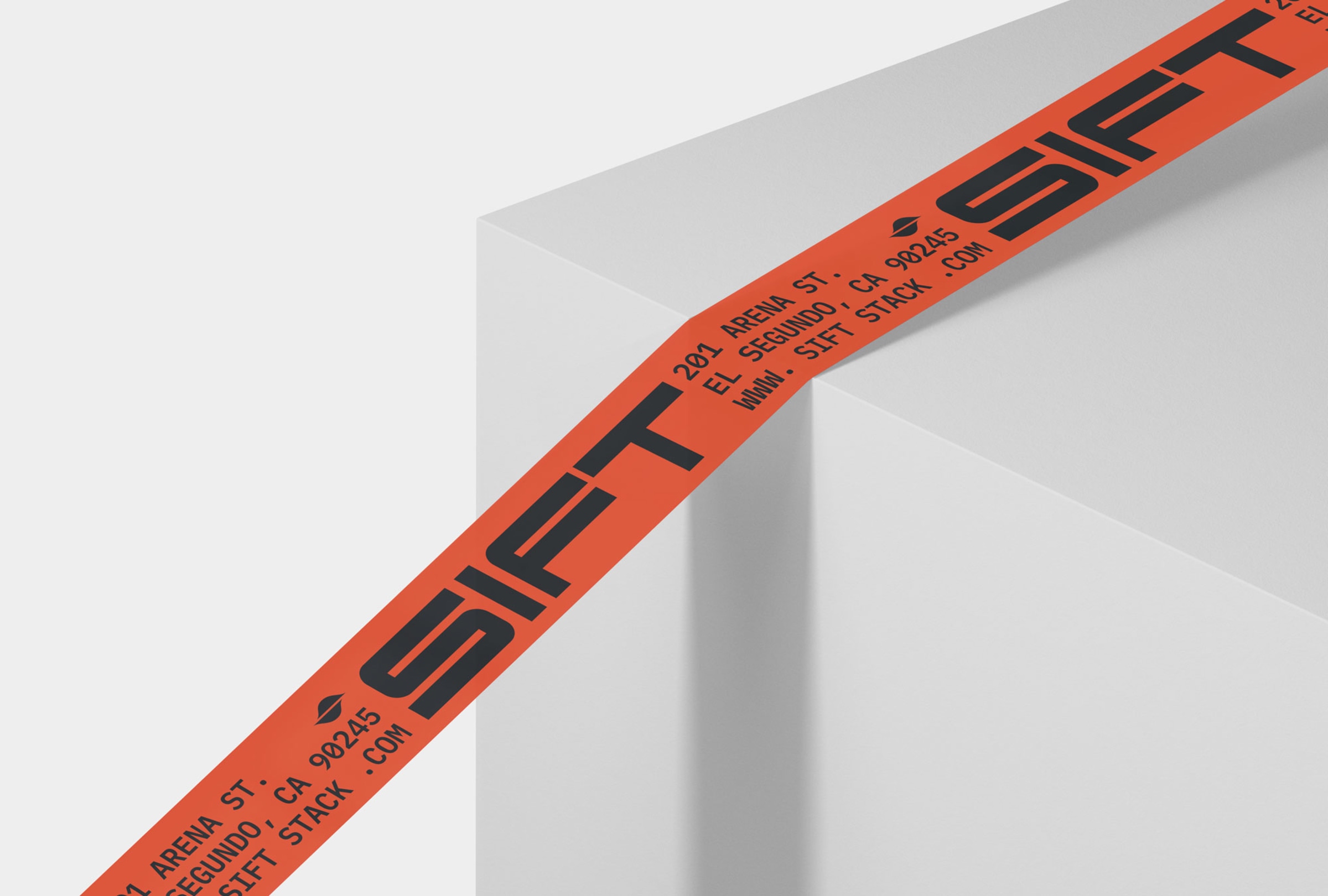
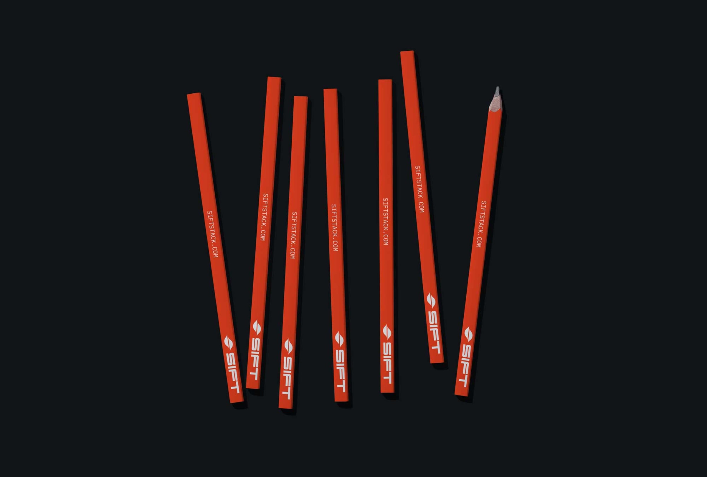
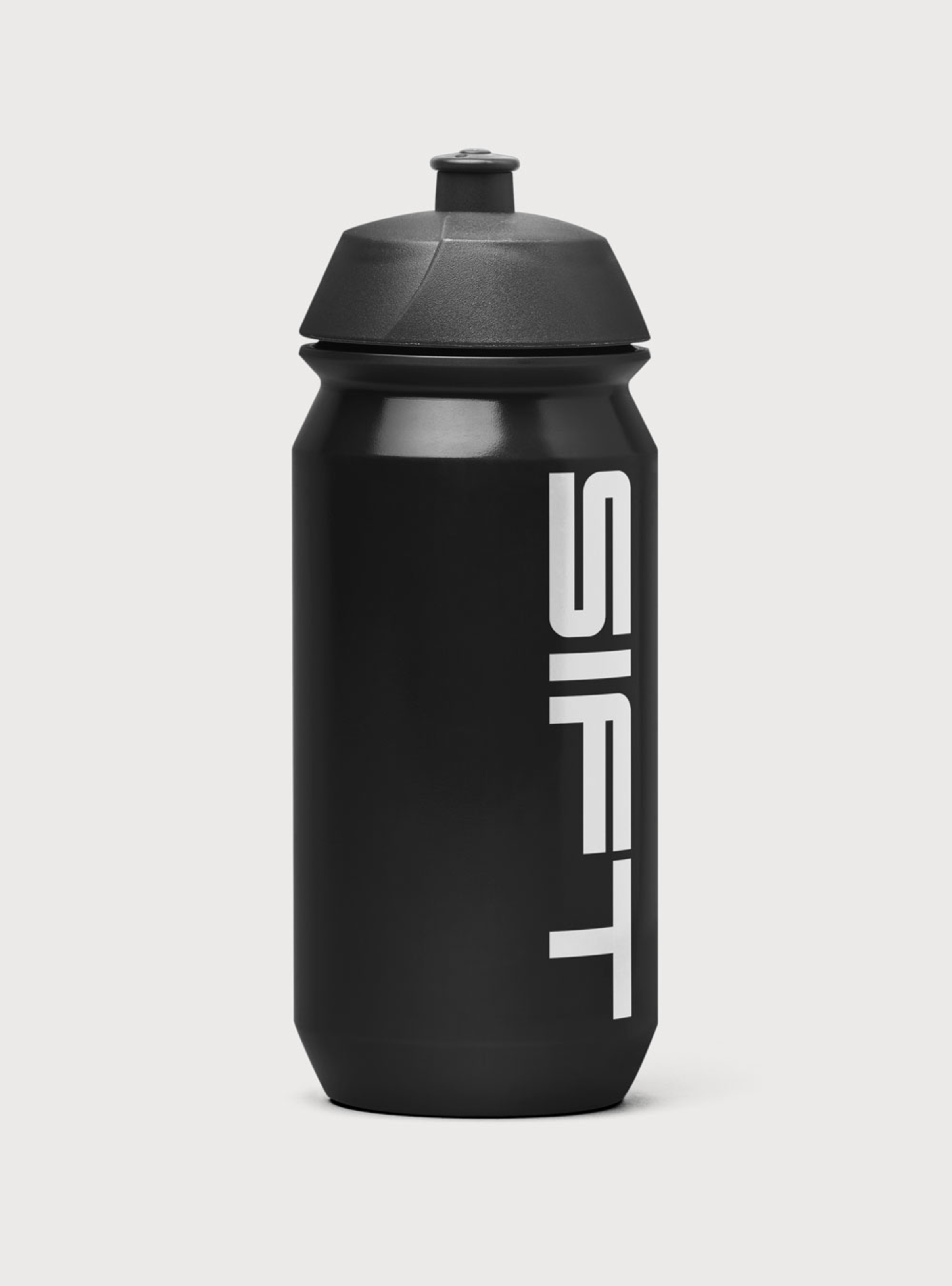
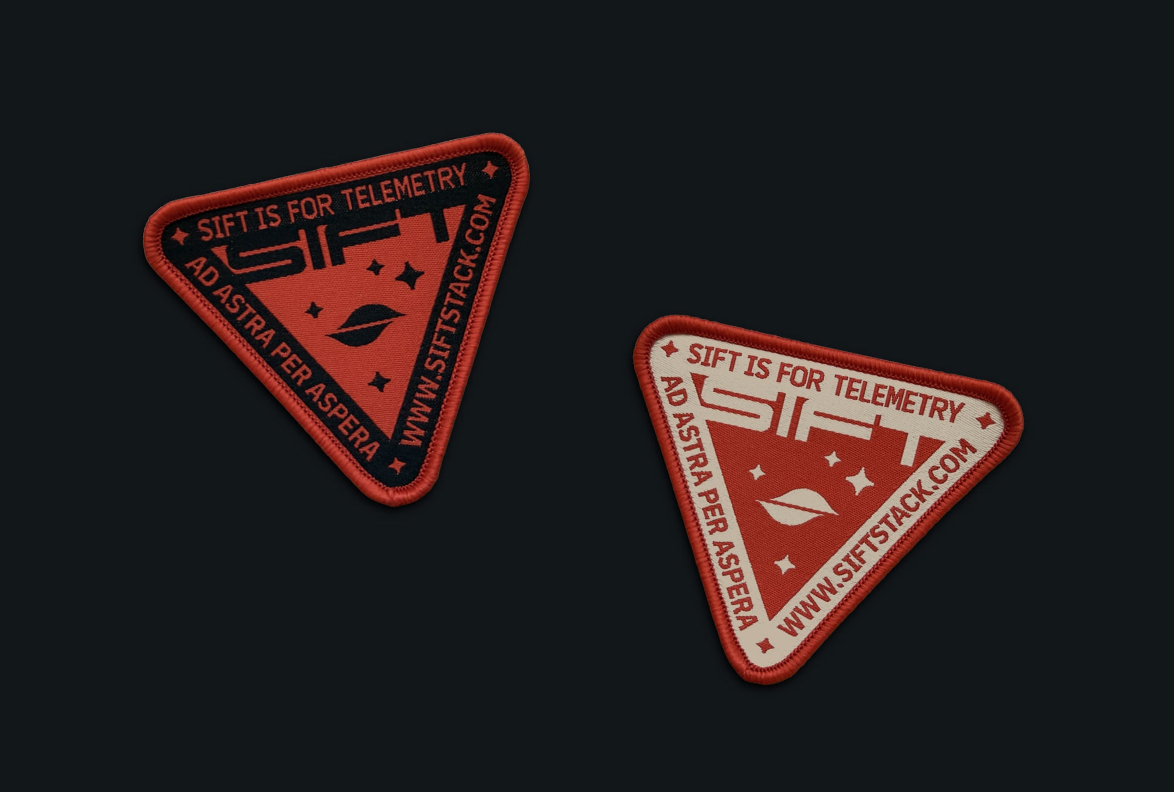
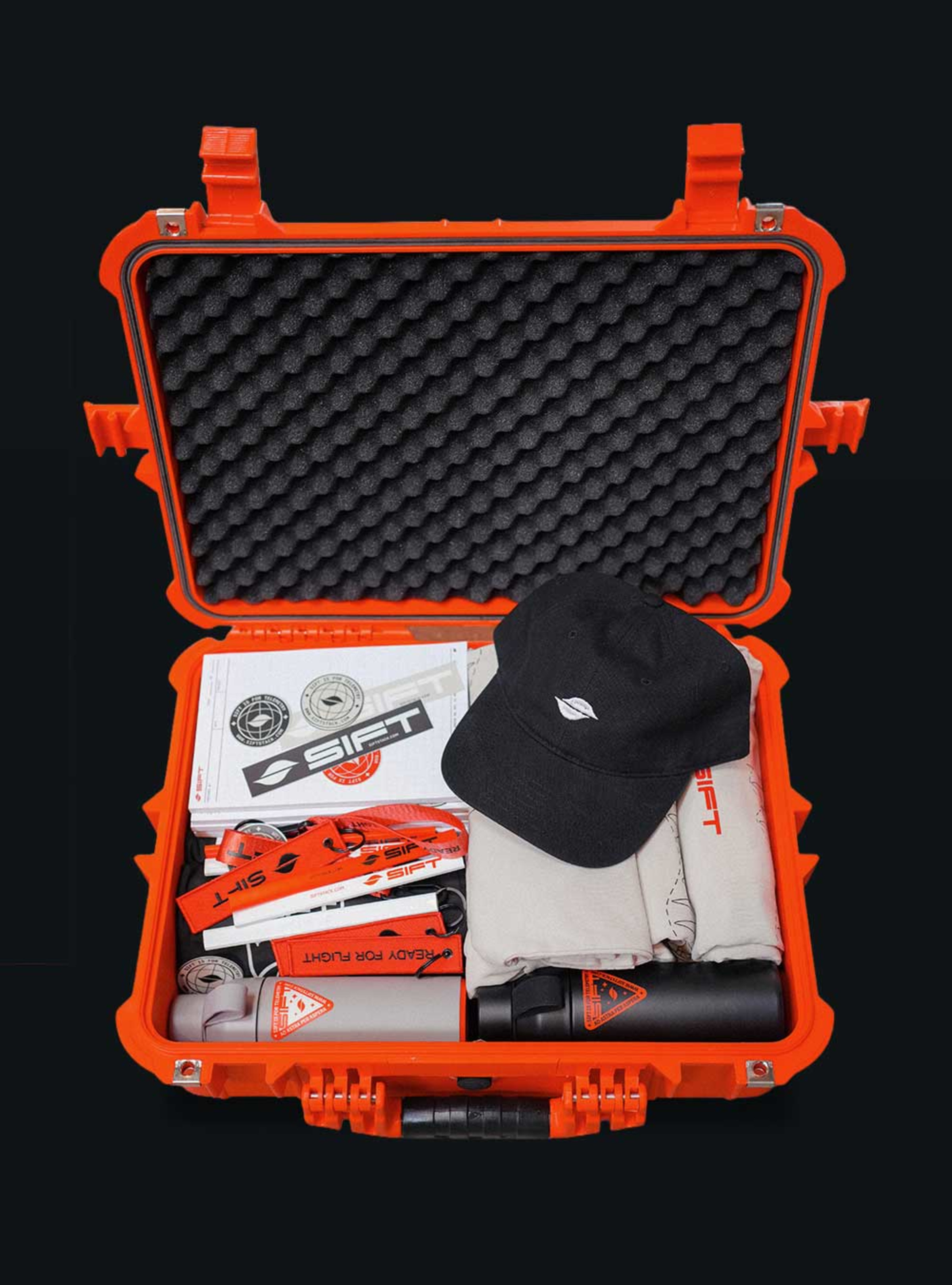
Sift's rebrand effectively uses a wider letterform wordmark with crisp rounded corners and tight counterspaces to convey engineered precision. The icon, reminiscent of acceleration diagrams, works well with the overall tech-forward aesthetic. The NASA-esque badge with IBM Plex Mono reinforces this, despite the large typesetting making it somewhat clunky in some applications. I'd explore finer type hierarchies.