[loading]
Software
Transportation
inDrive
by Border zero
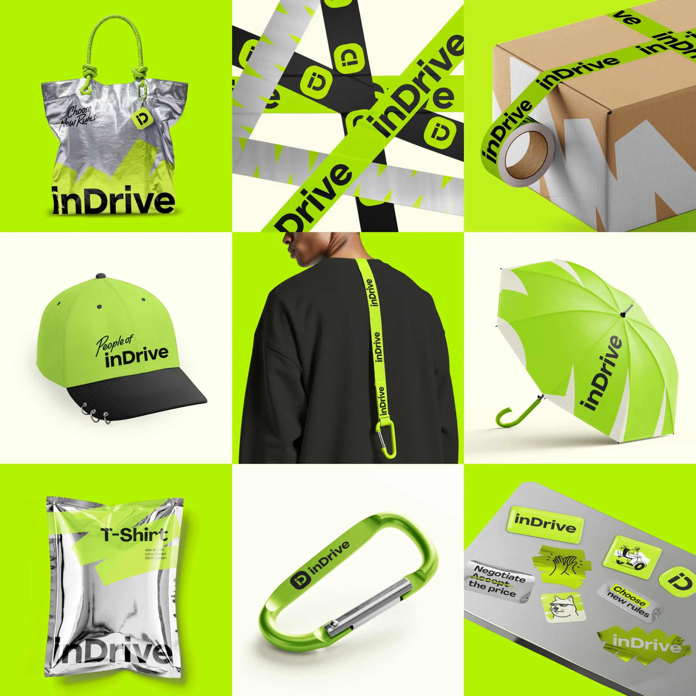
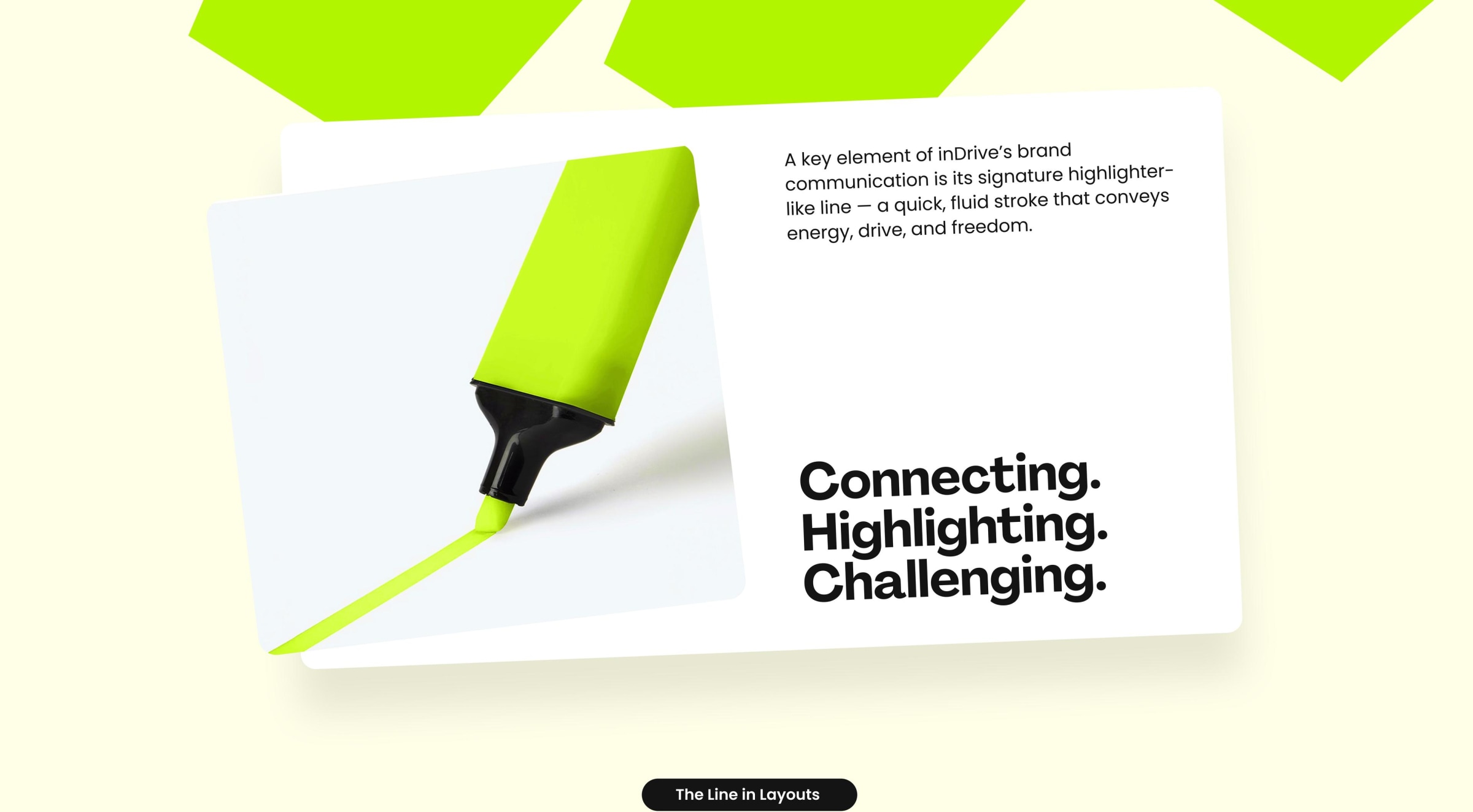
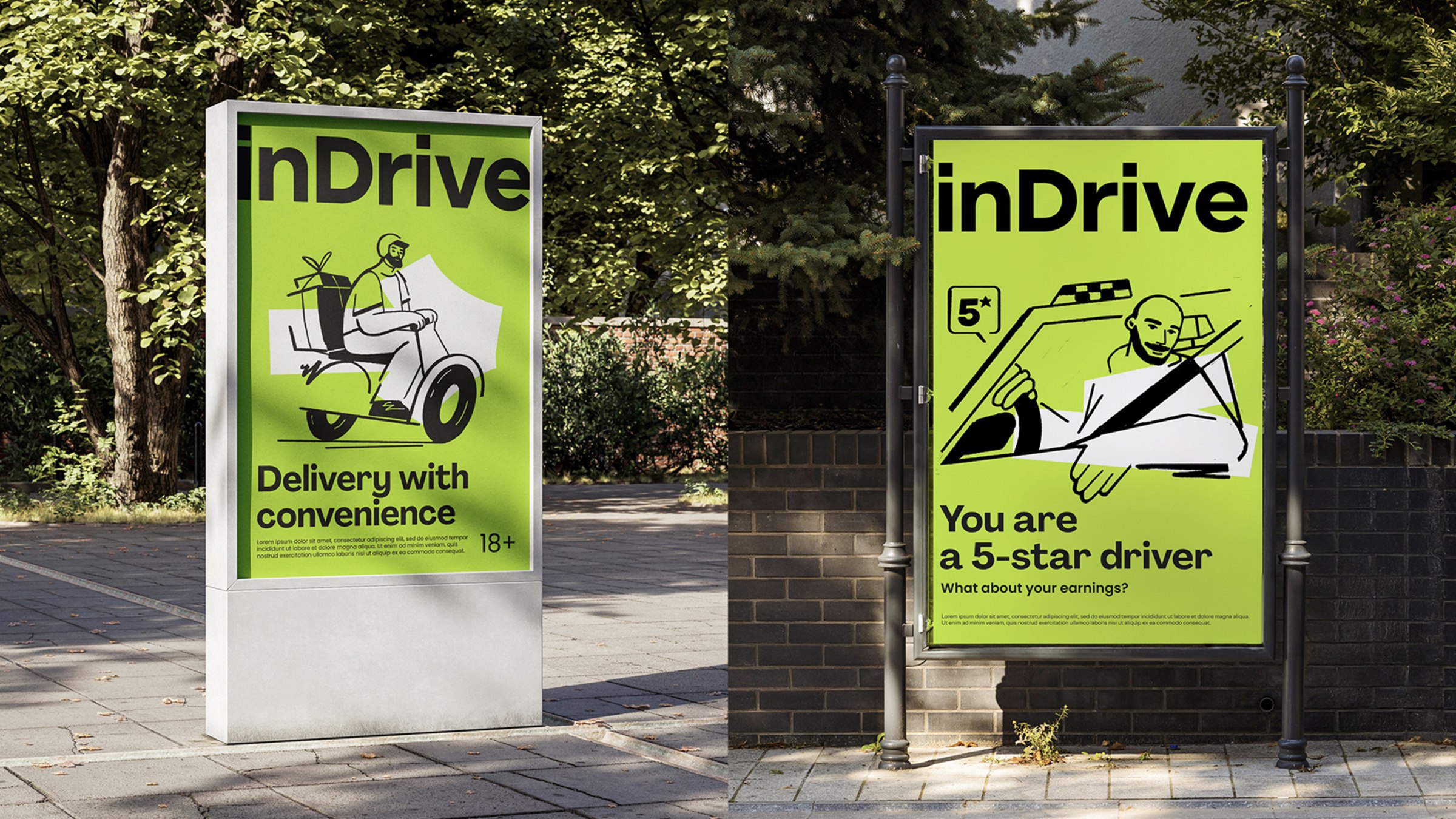
inDrive's rebrand centers on a minimal marker graphic, offering a performative element to their mission. The system uses a reduced toolkit with fewer display and text fonts to ensure global scalability, which is always smart for international brands. I appreciate the sketch-like illustrations for immediate visual impact and the intensified green. While the Agrandir typeface provides quirkiness, its combination with the wordmark is slightly incongruent.