[loading]
Finance
Software
Finom
by Border zero
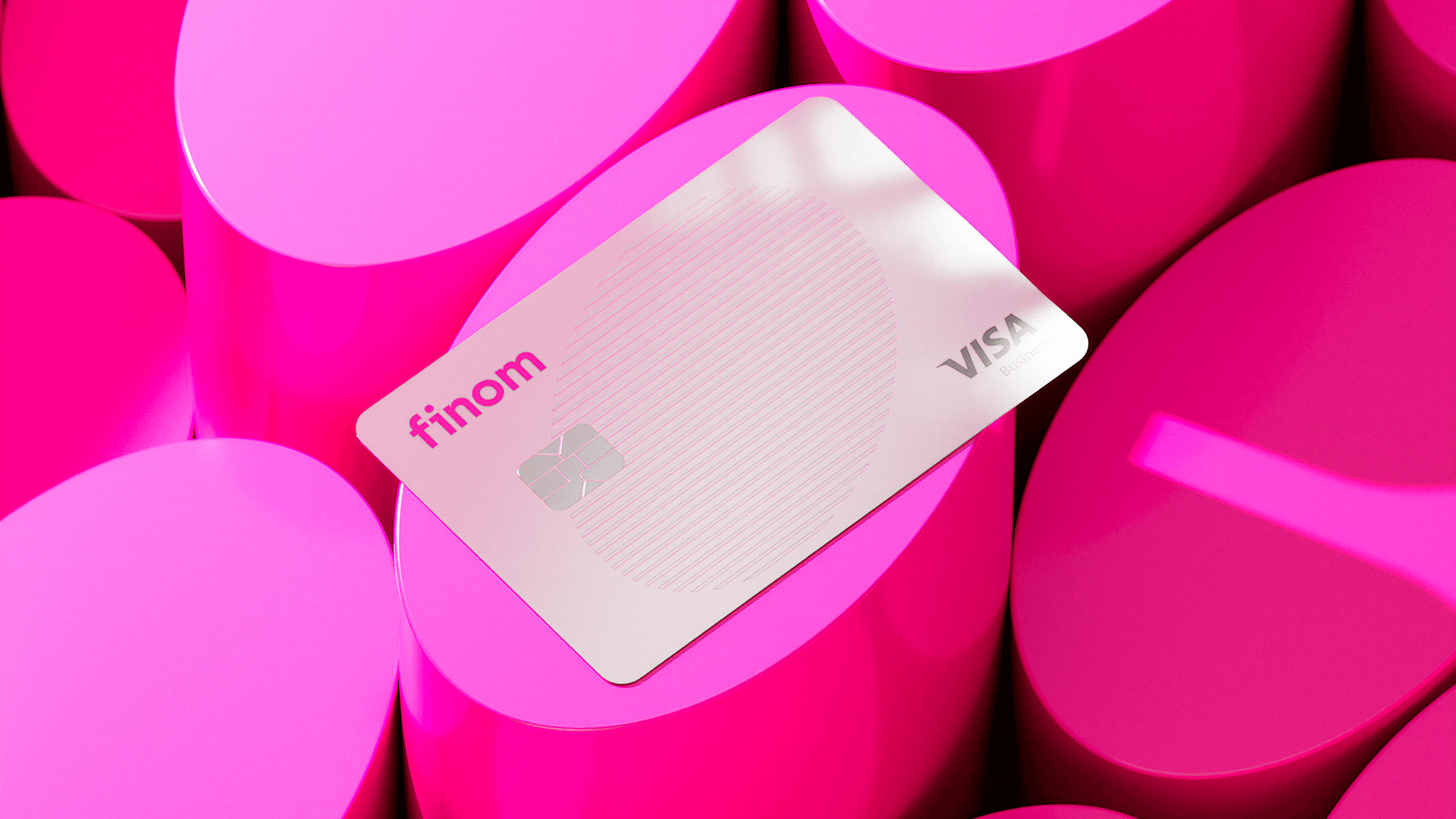
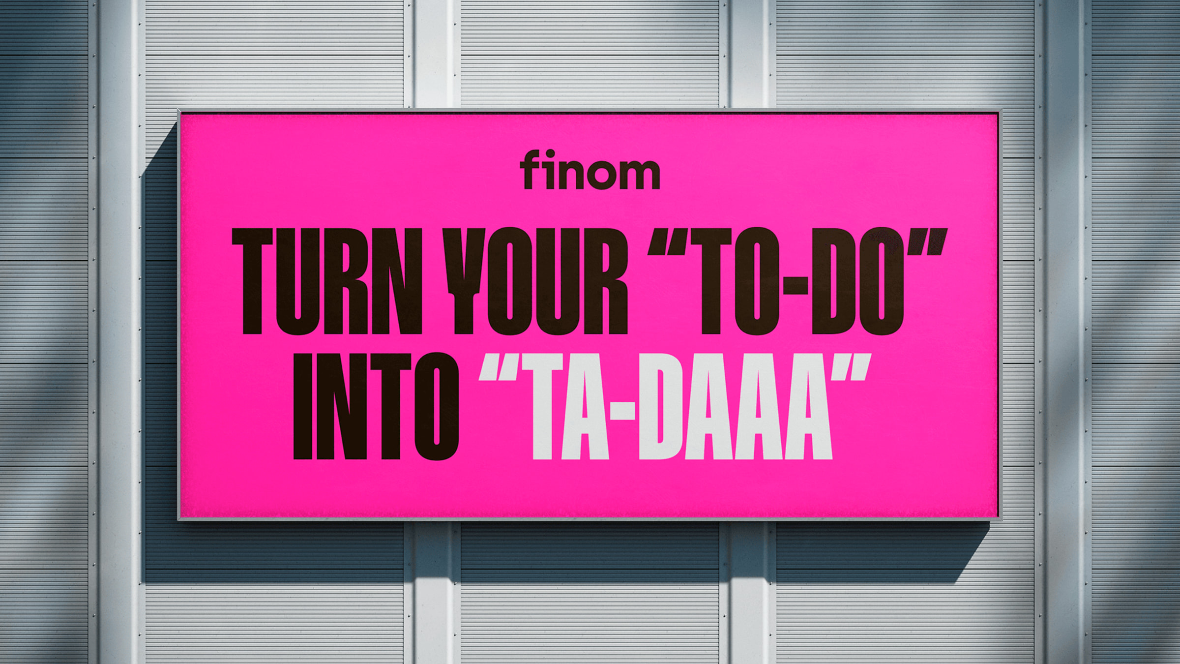
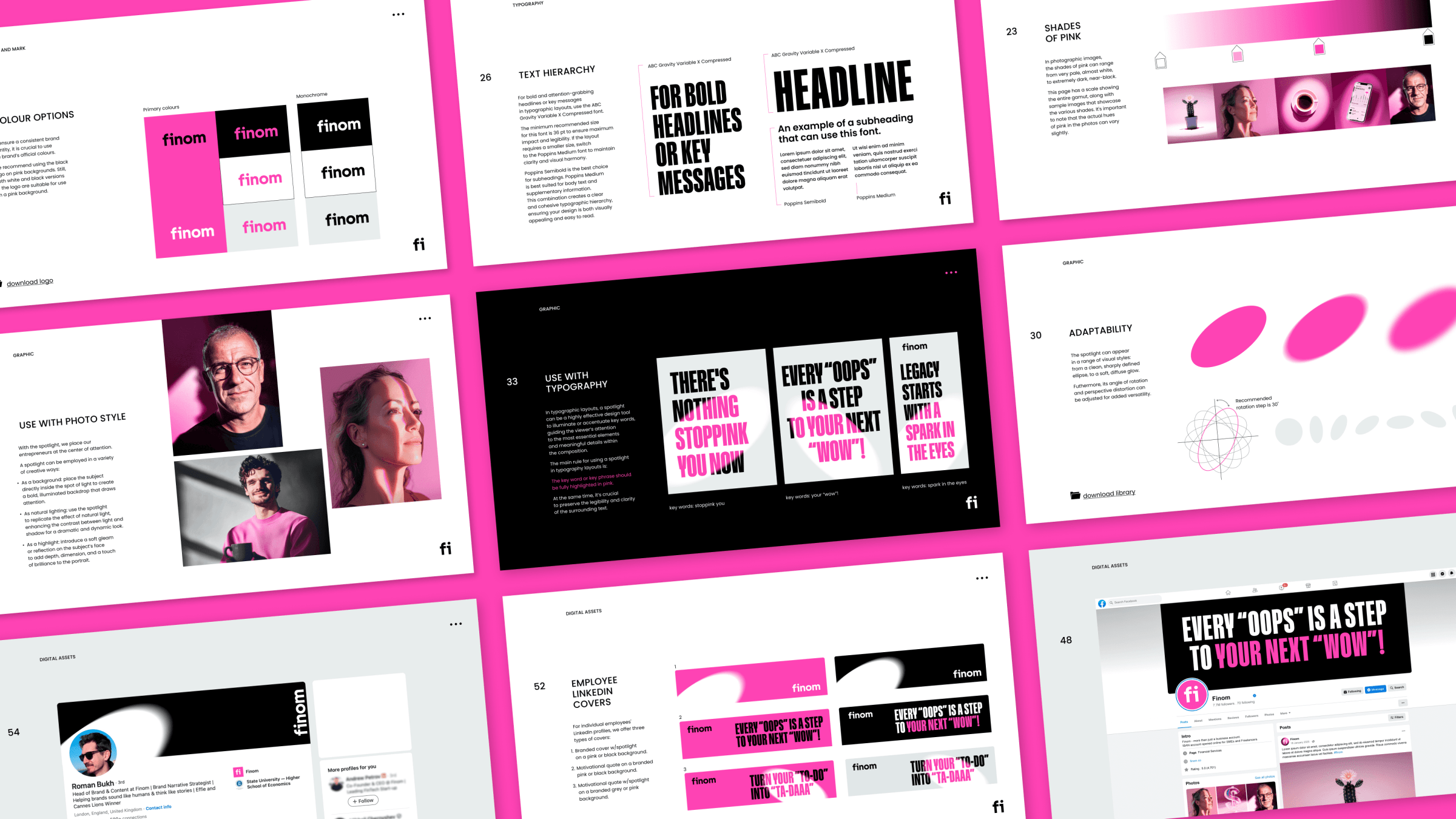
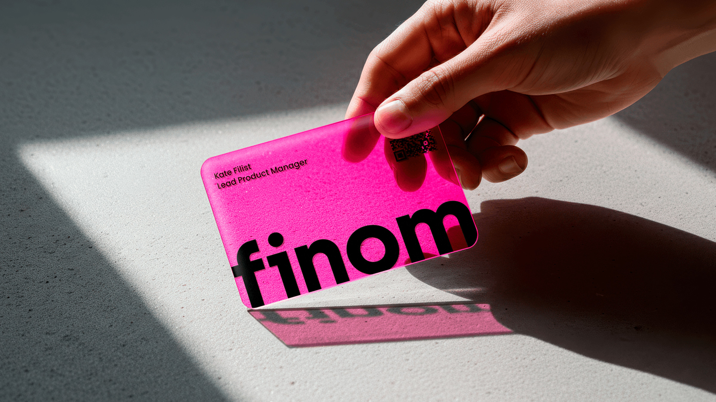
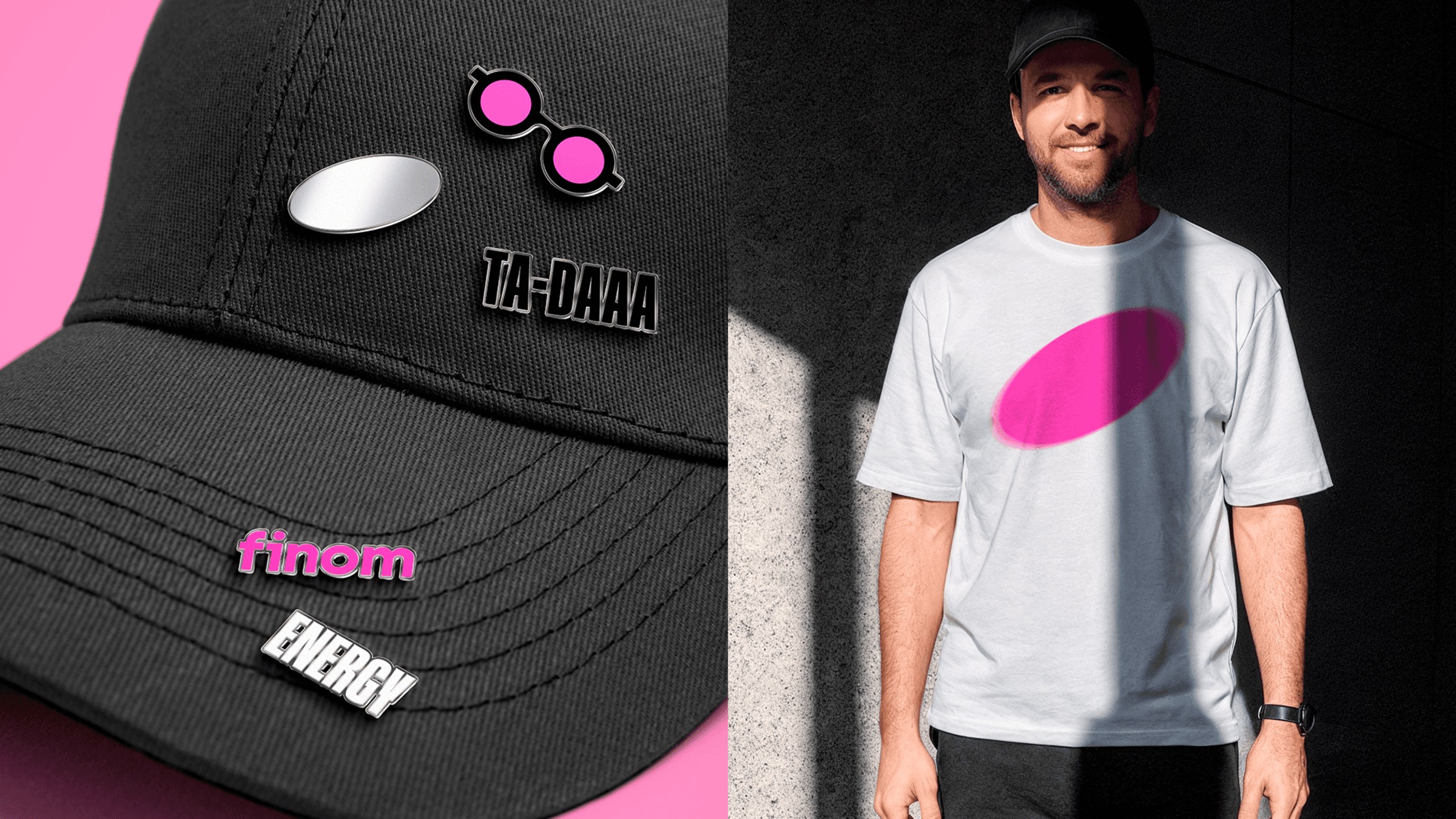
Finom's rebrand uses a 'spotlight' graphic motif to guide attention and create distinction, effectively implemented across various applications, from print to digital. The vibrant pink and deep black palette adds a contemporary edge to the fintech brand. While the brand chose Gravity for headlines, it doesn't quite integrate with the overall identity. The lowercase sans serif logo aims for approachability, however, the lack of a prominent ligature feels like a missed opportunity.