[loading]
Food & Drink
Coaltown Coffee
by Smörgåsbord
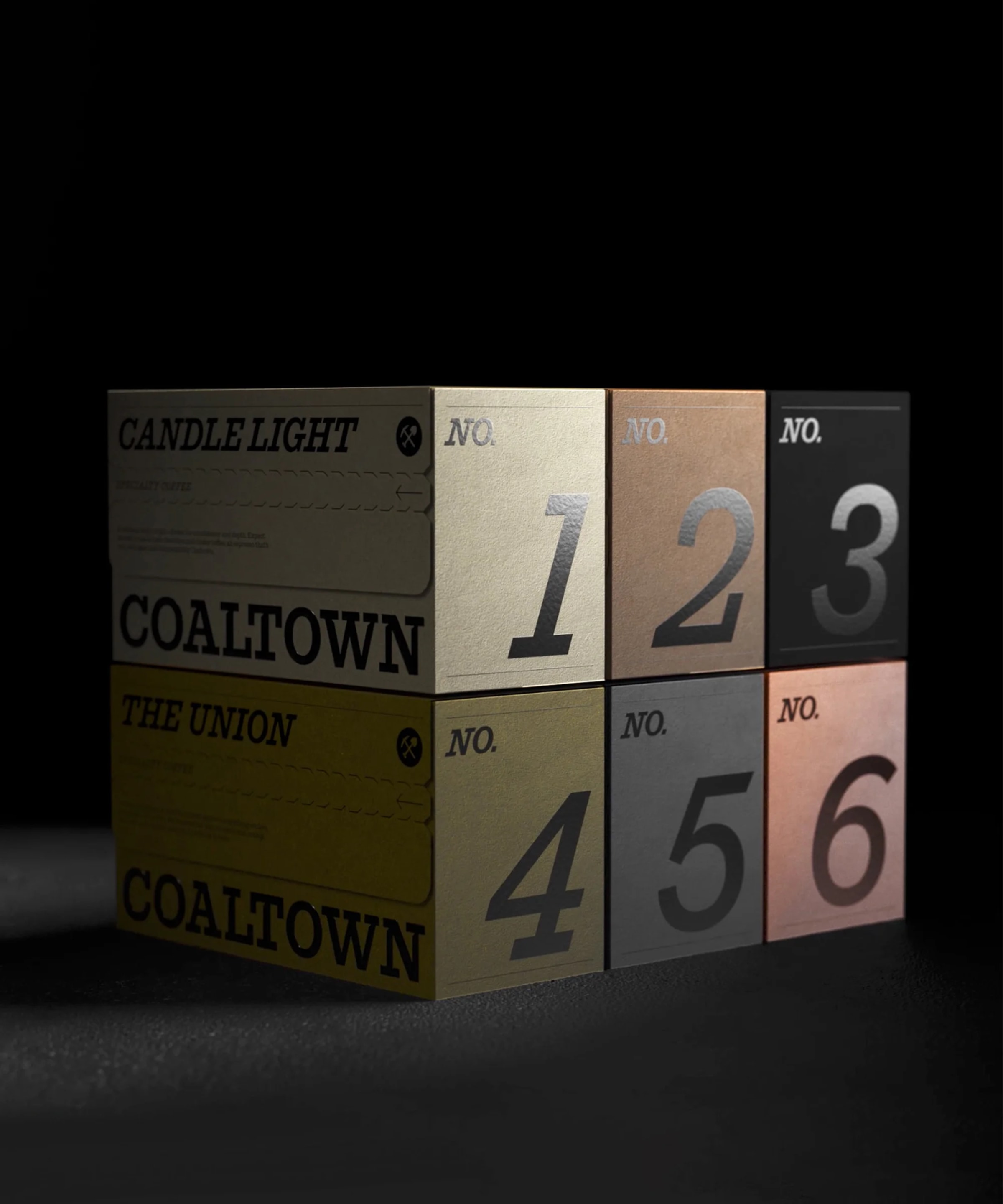
Coaltown Coffee's rebrand effectively customizes Commercial Type's Successor, adding subtle nicks to the letterforms to reference mining tools. This detail links the typography directly to the brand's heritage, allowing a single robust type family to carry the entire identity. The use of a historically relevant slab serif also grounds the brand in its industrial past. It’s a smart move to infuse meaning into the typeface without resorting to overly literal or cliché imagery.