


Raleway
Raleway is an elegant sans-serif typeface family. Initially designed by Matt McInerney as a single thin weight, it was expanded into a 9 weight family by Pablo Impallari and Rodrigo Fuenzalida in 2012 and iKerned by Igino Marini. A thorough review and italic was added in 2016. It is a display face and the download features both old style and lining numerals, standard and discretionary ligatures, a pretty complete set of diacritics, as well as a stylistic alternate inspired by more geometric sans-serif typefaces than its neo-grotesque inspired default character set. It also has a sister family, Raleway Dots . More information can be found at theleagueofmoveabletype.com/raleway and impallari.com/fonts/raleway To contribute to the project, visit github.com/impallari/Raleway
- Classification
- Sans
- Foundry
- License
- free
- Source
- Get this font ↗
01Style templates
Raleway for the heading, ABC Arizona Flare for the body.
03Projects using Raleway
View all →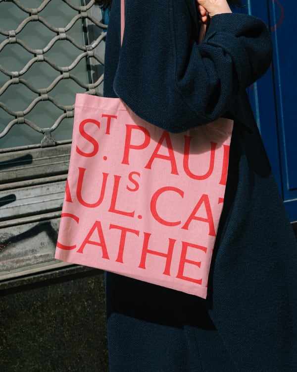
AaBbCc
0123456789
{(!@#$?&})
05Type scale
Waterfall · 64 → 16 pxDesign starts with a question.
Good letters carry the memory of the pen.
A soft serif with old-style warmth, drawn for display sizes and unhurried reading.
This typeface borrows the melting charm of phototype and rebuilds it, patiently, for the screen.
At text sizes the warmth settles into something quieter: open counters, a generous x-height, and forms that curve rather than cut. It reads like a well-worn paperback — familiar, unhurried, and slightly mischievous.
06Weights
9 styles07In context
Text settingsGood letters carry the memory of the pen.
The brief asked for warmth without nostalgia, and authority without sternness. Raleway answered both at once — a face that feels typeset by hand yet holds up at retinal resolutions. At this size it settles into an unhurried rhythm: generous spacing, open counters, and letterforms that carry tone before they announce themselves.
Small sizes are where display faces usually apologise for themselves. Raleway does not. Drop into text and the texture tightens into a competent, readable grey — open counters, a generous x-height, and forms that curve rather than cut. At text sizes the warmth settles into something quieter: familiar, unhurried, and slightly mischievous. It reads like a well-worn paperback, holding its voice across captions, footnotes, and long paragraphs without flattening into noise. Paired with a neutral grotesque for wayfinding and labels, it gives an identity system exactly one strong opinion — usually the right number — while the body keeps doing the quiet work underneath.
08Character set
Hover a glyph to inspect09About Raleway
Raleway is an elegant sans-serif typeface family. Initially designed by Matt McInerney as a single thin weight, it was expanded into a 9 weight family by Pablo Impallari and Rodrigo Fuenzalida in 2012 and iKerned by Igino Marini. A thorough review and italic was added in 2016. It is a display face and the download features both old style and lining numerals, standard and discretionary ligatures, a pretty complete set of diacritics, as well as a stylistic alternate inspired by more geometric sans-serif typefaces than its neo-grotesque inspired default character set. It also has a sister family, Raleway Dots . More information can be found at theleagueofmoveabletype.com/raleway and impallari.com/fonts/raleway To contribute to the project, visit github.com/impallari/Raleway